Battery Health
This section offers detailed metrics on device battery performance, supporting maintenance and longevity strategies.
Current Battery Capacity:
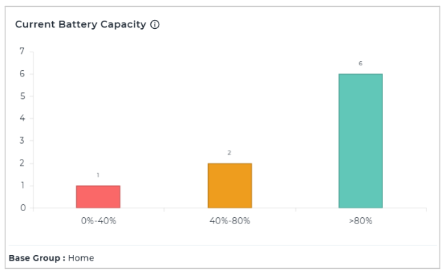
The Current Battery Capacity chart represents the current battery capacity across devices, showing the distribution of the percentage of battery capacity remaining compared to the manufacturer-designed capacity. The bar graph categorizes devices into different capacity ranges, the x-axis displays battery percentage intervals, while the y-axis represents the number of devices in each range, making it easy to identify how many devices fall into each battery health category.
Factory Battery Capacity
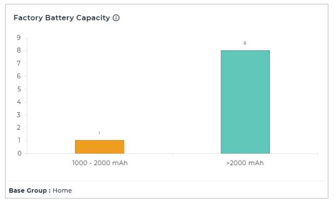
The Factory Battery Capacity chart represents the distribution of original (manufacturer-designed) battery capacity of devices. The x-axis displays battery capacity ranges in mAh, while the y-axis indicates the number of devices in each range, making it easy to see how many devices belong to each factory battery specification category.
Charge Cycles:
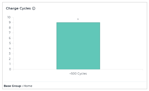
The Charge Cycles chart represents the distribution of full battery charge cycles across devices, measured over the device’s lifetime for Android 14 or higher, and from enrollment for earlier versions. The x-axis shows charge cycle ranges, while the y-axis indicates the number of devices in each range, making it easy to assess how many devices fall into each charge cycle category.
Battery Health:
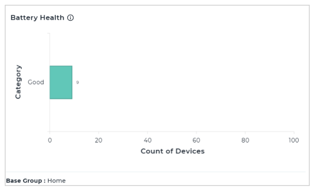
The Battery Health chart represents overall battery health across devices, categorizing them based on the extent of battery capacity degradation. The x-axis shows the count of devices, while the y-axis displays different health categories, making it easy to see how many devices fall into each battery health status.
Charge Level at Time:
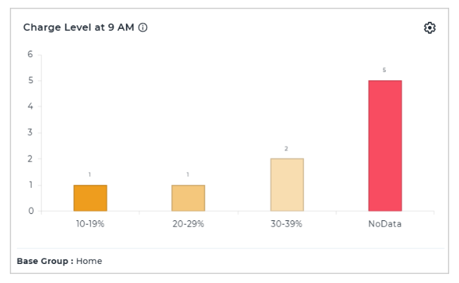
The Charge Level at 9 AM chart represents device charge levels at a specified time, giving a snapshot of battery percentage distribution across devices. The x-axis displays different charge percentage ranges, while the y-axis indicates the count of devices in each range, making it easy to assess battery status at that specific hour. This chart is configurable, allowing users to specify the time.
Temperature:
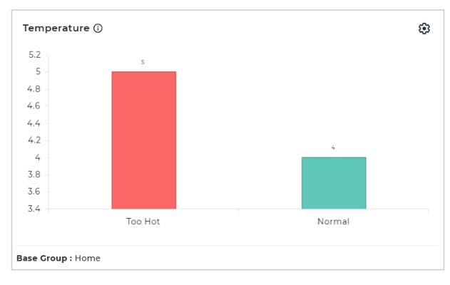
The Temperature chart represents the distribution of battery temperatures across devices, helping to monitor and identify overheating risks. The x-axis displays temperature categories, while the y-axis shows the count of devices in each category, making it easy to spot how many devices fall into each temperature range. The threshold for temperature categories are configurable.