Create and Add Charts to the Dashboard
Create a Dashboard
Create a dashboard and monitor your fleet of devices in the SureMDM console. To create a dashboard in the SureMDM console, follow these steps:
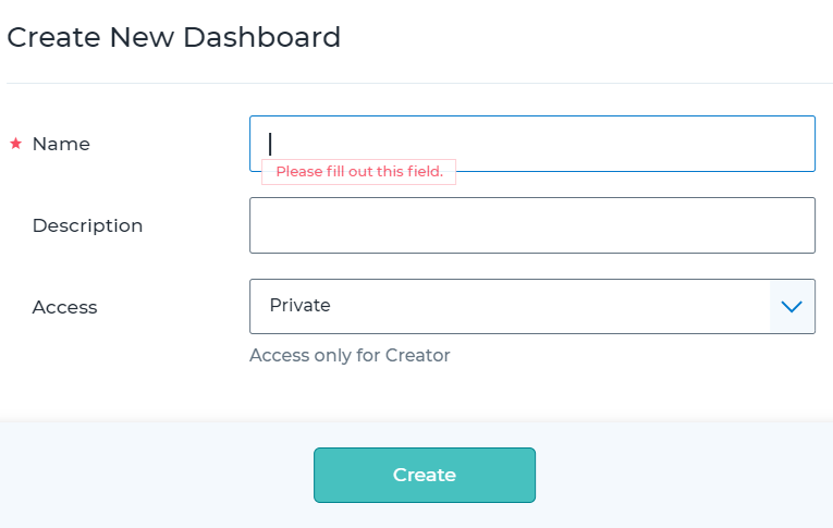
Navigate to Dashboard > All Dashboards > Create Dashboard.
Enter the following details.
Name - Enter a desired name for the dashboard.
Description - Enter the dashboard description.
Access - Please select any of the following options to restrict access to the dashboard:
Private: Access to the dashboard is restricted only to the creator of the dashboard.
My Account: Access to the dashboard is restricted to all the logged-in users of an account.
Roles: Access to the dashboard is based on the role level. Multiple roles can be selected from the list.
Users: Access to the dashboard is restricted to specific users only.
Once done, click Create to add the dashboard on the SureMDM console.
Manage Dashboard
Admins will be able to set a dashboard as the default, favorite it, add charts to the dashboard, and edit or delete a dashboard. The following options are available under the All Dashboards section.
Favorite - Select a dashboard as a favorite. The selected dashboard will be added under Favorite Dashboard section.
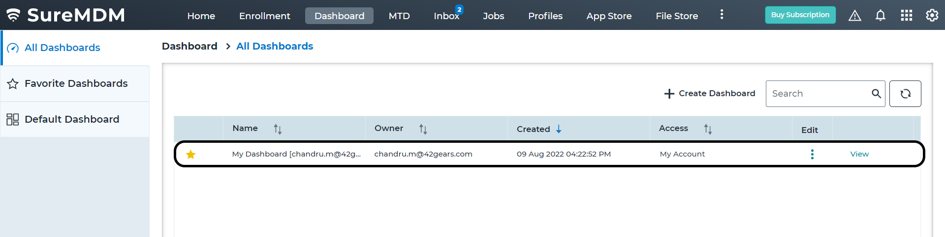
Name - View the name of the dashboard.
Owner - View the email address of the user who created the dashboard.
Created - View the date and time when the dashboard was created.
Access - View the dashboard access details.
Edit - Edit/delete the dashboard.
View - View the personalized dashboard.
Add Charts to the Dashboard
Add the charts based on your requirements in the SureMDM console. To add charts to the dashboard, follow these steps:
Create a dashboard.
On the All Dashboards screen, click View of the dashboard.
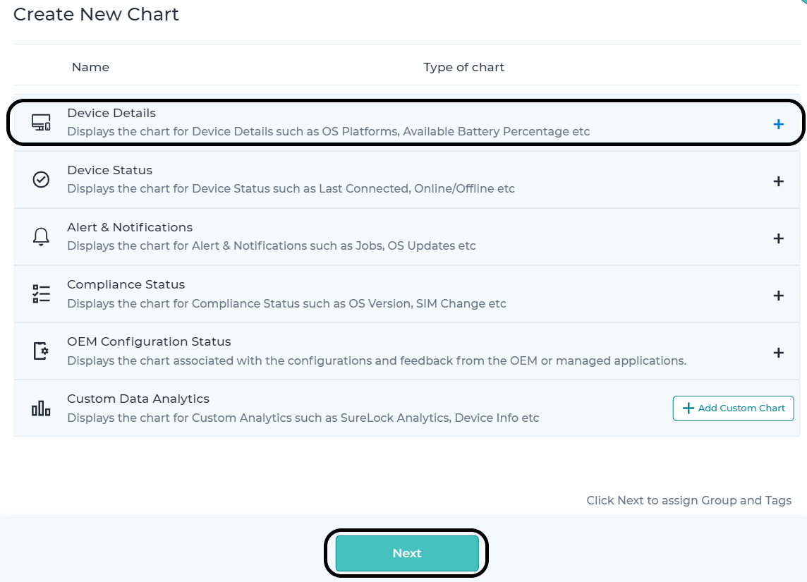
Click Add Chart.
On the Create New Charts popup, select the chart based on your requirement and click Next.
Select a group from the Groups list or select a tag from the Tags list.
Once done, click Save to add the chart to the dashboard.
You can perform the following actions on the dashboard:
Edit Dashboard - Edit the dashboard settings.
Copy Dashboard - Creates a duplicate of the dashboard.
Add to Favorite - Add the dashboard to favorite section.
Remove from Favorite - Removes the dashboard from the favorites list.
Add Custom Data Analytics
Custom data analytics can be created in the SureMDM console's dashboard. To create custom data analytics, follow these steps:
Navigate to Dashboard > All Dashboards.
Select a dashboard and click View.
Click Add Chart > Add Custom Chart under Custom Data Analytics.
Select any of the following widgets:
- Device Count
- Aggregation
- Map Analytics.
To set up a widget, enter the following details:
Name Of The Widget - Enter the name of the widget
Time Span - Select time span from the following:
- Last 24 Hours
- Last Week
- Last 30 Days
- Specify a custom range.
Data Source - This is the source from which the data is to be collected. Click the drop-down menu to see the list of analytics available. They are either analytics with floating values created in the Data Analytics section under Account Settings or default analytics for device details listed in the Device Information section. The admins can view the analytics data for the sources such as SureLockAnalytics, SureFoxAnalytics, AlertMessageAnalytics, Deviceinfo, Datausage, and more.
To view analytics with floating values, navigate to Settings > Account Settings > Data Analytics and look for entries that have their value listed as Float.
- Analysis Data - This is the data value (based on the WiFi or Mobile data usage) that needs to be extracted from the source.
- Signal Radius - This represents the value in Km (1-100). Map analytics data will be generated for the devices that are available within the specified range.
- X-Axis Content - This represents the value that needs to be plotted on the X-Axis of the widget. You can select a value for the X-Axis content from the following options: Hours / WebSite Name/ URL.
- High Value (Device Count only) – This is the highest value to be considered when the graph is created in the widget.
- Medium Value (Device Count only) – This is the medium value to be considered when the graph is created in the widget.
- Aggregate Value (Aggregation Only) – This is the value that the widget will extract from the Analysis Data. You can select this value to be the sum, average, maximum, or minimum.
- Once done, click create to add the custom analytics in the dashboard. The dashboard will start showing the newly created analytics widget.