Custom Data Analytics
With the Data Analytics feature in SureMDM, admins can view graphs that summarize all devices or drill down to a device or list of devices by simply clicking on corresponding parts of the graphs.
There are three types of widgets available in the Dashboard:
- Device Count - With this option, admins can configure a widget that will represent the analytics data as a graph with comparisons.
Aggregation - With this option, admins can configure a widget to show analytics data as a graph without any comparisons. It simply plots Time Span against the overall Aggregate Value.
- Map Analytics - With this option, admins can calculate the aggregate phone signal strength against each service operator in specific latitude and longitude on the map within the specified signal radius.
To create Custom Data Analytics in SureMDM, follow these steps:
1. Log in to the SureMDM Web Console.
2. Create a dashboard.
3. On the All Dashboards screen, click View of the dashboard.
4. Click Add Chart > Add Custom Chart under Custom Data Analytics.
5. Choose from Device Count / Aggregation / Map Analytics.
6. To set up a widget, enter the following details:
- Name Of The Widget
- Time Span: Select from Last 24 Hours, Last Week, Last 30 Days or specify a custom range.
- Data Source: This is the source from which the data is to be collected. Click the drop-down menu to see the list of analytics available. They are either analytics with floating values created in the Data Analytics section under Account Settings or default analytics for device details listed in the Device Information section. The admins can view the analytics data for the sources such as SureLockAnalytics, SureFoxAnalytics, AlertMessageAnalytics, Deviceinfo, Datausage, and more.
 Note: To view analytics with floating values, go to Settings > Account Settings > Data Analytics and look for entries that have their value listed as Float (see the screenshot below).
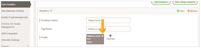
- Analysis Data - This is the data value (based on the WiFi or Mobile data usage) that needs to be extracted from the source. In the screenshot above, the floating Battery Level value is the Analysis Data.
- Signal Radius - This represents the value in Km (1-100). Map analytics data will be generated for the devices that are available within the specified range.
- X-Axis Content: This represents the value that needs to be plotted on the X-Axis of the widget. You can select a value for the X-Axis content from the following options: Hours/ Days/ Application Name/ Package Name.
- High Value (Device Count only) – This is the highest value to be considered when the graph is created in the widget.
- Medium Value (Device Count only) – This is the medium value to be considered when the graph is created in the widget.
- Aggregate Value (Aggregation Only) – This is the value that the widget will extract from the Analysis Data. You can select this value to be the sum, average, maximum, or minimum.
7. Click Configure.
Once done, the Dashboard will start showing the created analytics widget.